
Idea and Inspiration
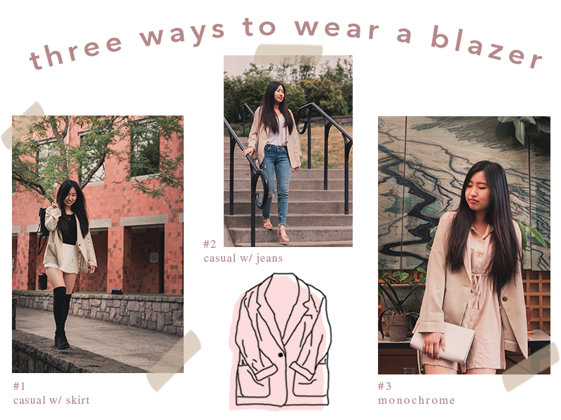
For this graphic design project, I have decided to create an online graphic for my blog. I wanted this to be a very minimalist look, but also convey the message I was trying to get across to my audience – which was, “three ways to wear a blazer”.
The main topic of this message was sustainable fashion. The idea was to choose one piece of timeless clothing and to style it in three different ways. The clothing item I chose was a beige blazer. Purchasing timeless pieces can go long ways when you can style it in many different ways other than wearing it to a business meeting or a job interview. The purpose of this graphic design was to display outfits you can pair a blazer with to create different looks.
Design Process
What inspired me of this idea to create this graphic design was the “10 ways to (re)wear a dress” video by Ashley (aka “Best Dressed” on YouTube). She created a video showing 10 different ways you could wear a single dress. This inspired me to do the same with a beige blazer that I own. The purpose was to select a timeless and versatile piece that you can wear in many different styles.
The significance of the elements in my design was simplicity. I wanted to create something simple & clean, and that also followed the color & style of my blog. My first thought was to create something similar to a fashion magazine, but I wanted something simpler. Not because of laziness, but because I wanted to go for a minimalist look, but in a cute way. It lead me to think of fashion sketchbooks and bullet journals. So I thought, why not combine the two and make something like a page of a “fashion journal”! I’m not too sure if that’s a thing, but I wanted to create something in a style of a “journal”.
Technical Detail
This is where I made revisions in swapping out the photos with edited ones to match my blog, and also using the brush tool and creating “tape” like lines on the photos. I did this by playing around with the opacity to get the transparent look of “tape”. I thought this would add more of a casual personal “journal” look. I also used the brush tool to create the drawing of my blazer to add in a “doodle”. I decided to keep the header and descriptions in a clean font in order to create a cleaner look overall.
I did take in the feedback given to me on my draft and tried out a cut-out, changing the warp on the text, and even adding in the word “beige” to the heading, but it didn’t seem to go so well. I did go through with one feedback said to me in person of making the blazer drawing into a “offset color”. I decided to try it out and liked it much better than what I had originally done in my draft.
