Idea and Inspiration
For this project, I have decided to create a site logo for my blog. Site logos are generally small, so I figured something simple but with a purpose would be the best way to go for this.
Design and Process
What influenced me to design this logo was the name I chose for my blog. I was thinking of doing outlines of clothes, or things associated with the word “closet” and “fashion”, and thought the most cleanest design would be a plain coat hanger. I also wanted to incorporate the blog name somewhere with the logo, so my plan was to make my name cursive and connect to both ends of the hanger part (but that didn’t work out too well as you can see). I also thought since everything else about the logo was rounded, having the word “closet” be a different font would help make it stand out. Overall, trying to create this logo on Illustrator turned out different than what I was going for (sketch).
Technical Detail
I used the gradient tool for the pink circle gradient in the background. I added it because after creating the logo, it looked a bit plain. But now that I look at it, I don’t really like it anymore and it seems a bit “cheesy”. I used the pen tool for the hook of the hanger, and shapes for the triangle hanger shape to create my logo.
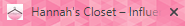
After adding my rough draft logo to my blog as a site logo, I realized I should have made the background transparent. That is something I am willing to fix for my final draft. Here is an image below of what I mean: